Blood Posters
View our gallery to learn more about each poster and its creator.


Some of our blood posters speak specifically to the theme of blood donation. They encourage viewers to consider donating blood using various tropes, images, and messages.
“I love blood, the many meanings of blood. I love horror films and actors of the day such as Bela Lugosi. He was the first ever Dracula. I love the art of blood.”
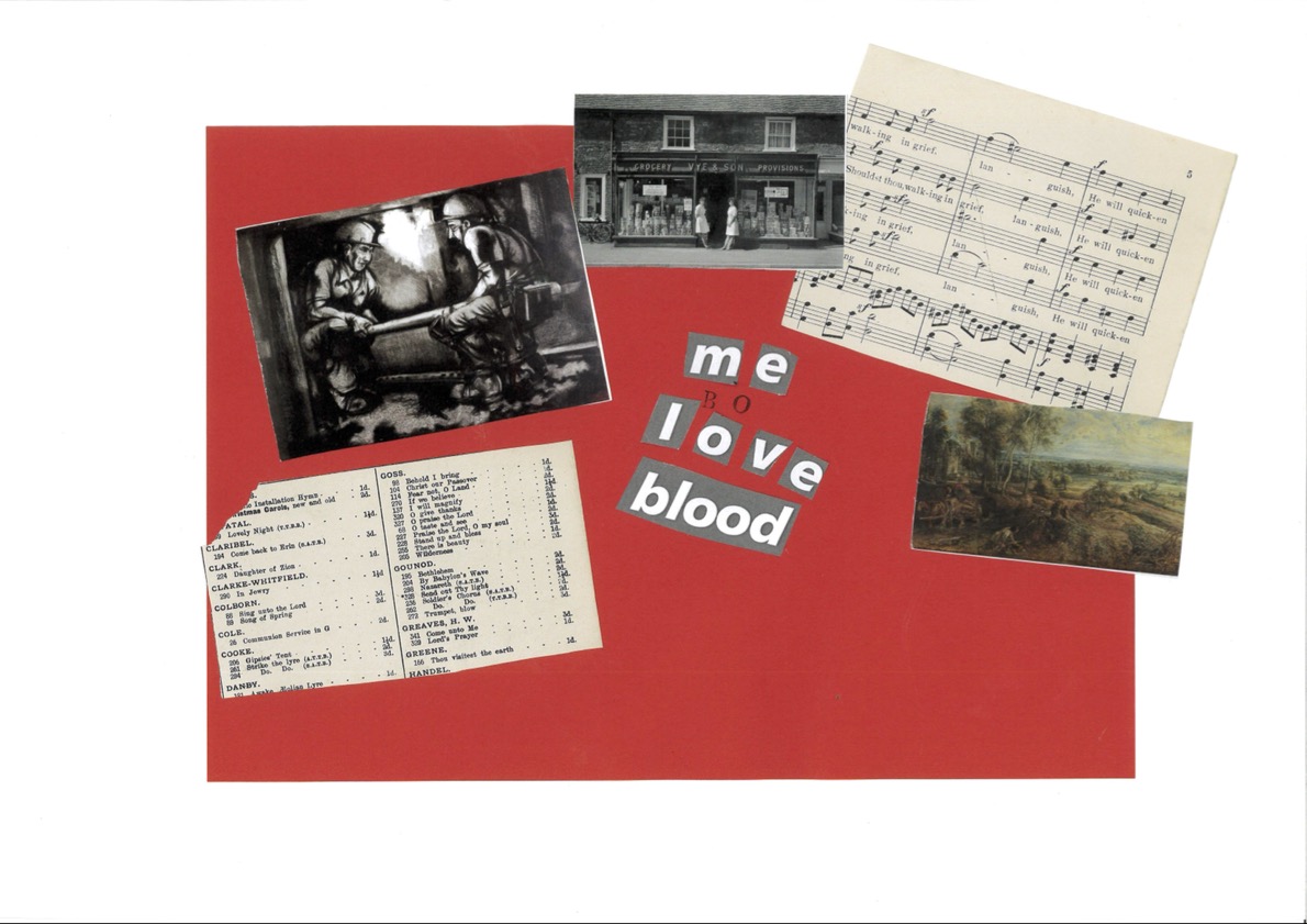
“I designed my poster with a Victorian audience in mind. Given that the first successful blood transfusion took place in 1818, I tried to envisage what a Victorian blood donation poster might look like. I anticipated that it might take the form of a ballad to be sung in the streets to entice people to donate their blood.”

“I didn’t plan for the poster to be as political as it turned out. I wanted to do something different than using red and mixed various textures and colours instead. But then I started thinking more about the blood scandal and how certain groups are restricted or denied the opportunity to donate blood and thought justice seemed apt.”

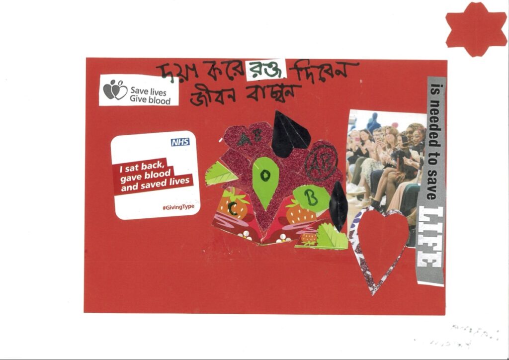
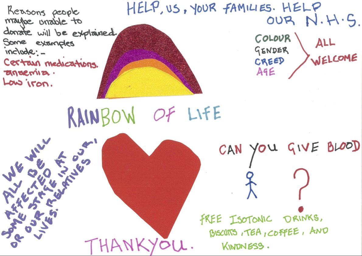
“The top section of my poster shows the initial message of NHSBT. However, the bottom half shows more of the challenges surrounding donation. My poster highlights how blood donation can be a challenge for many for a variety of reasons.”

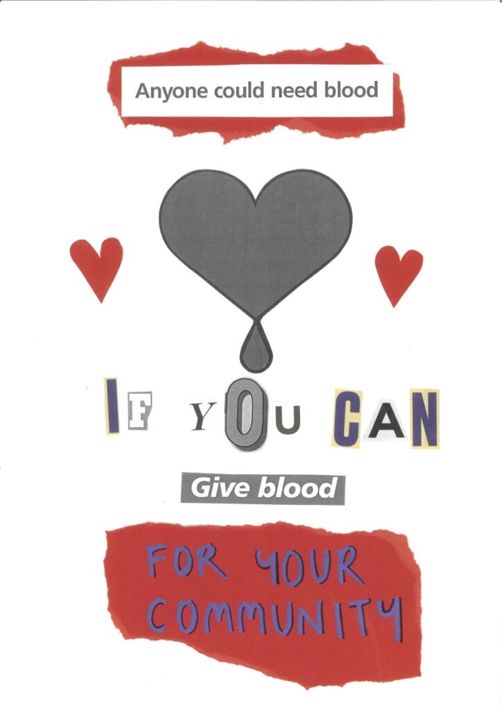
“I wanted it to be bright and positive, and knowing anyone can approach, in a safe environment.”
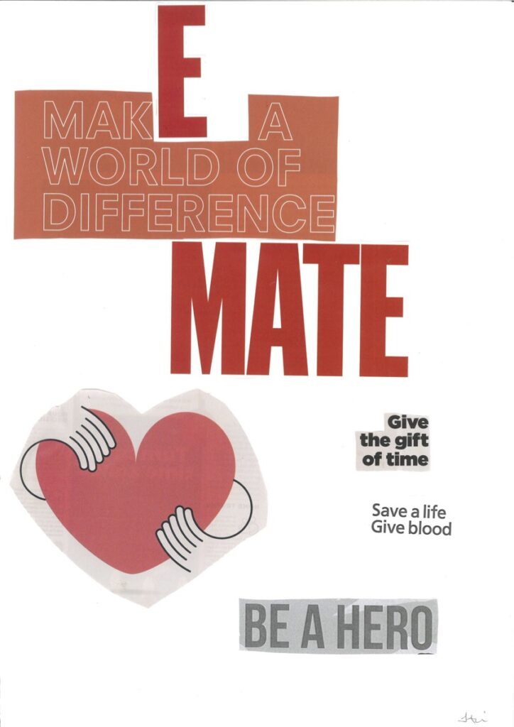
“Giving blood is like a good deed/charity. Anyone can make a positive difference to the world and has something to offer. Why not give blood? It’s a great thing to give blood as it can give the gift of time!”

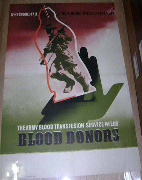
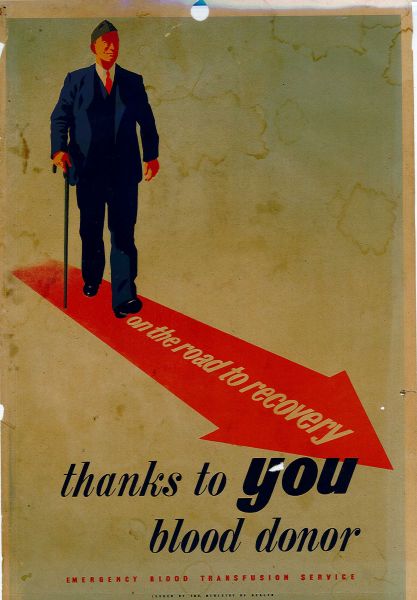
Historically, posters encouraging blood donation have spoken to a variety of issues and audiences. Below are some donation posters dating back to the 1940s. Can you spot any parallels between these posters and the ones designed by us?
![Poster shows a football crowd with one red-faced supporter jumping up, shouting and waving his rattle. Above this is: HE CAN SPARE A LITTLE BLOOD ! and below WILL YOU ? On a red band in white lettering is BLOOD DONORS ARE URGENTLY NEEDED and below that NATIONAL BLOOD TRANSFUSION SERVICE In the bottom margin in tiny lettering is: Issued by the Ministry of Health Printed for H.M. Stationery office by Sanders Phillips & Co. Ltd. Wt. No.35625 N.B.T.S. 1008 [all in same line].](https://hematopolitics.org/wp-content/uploads/sites/112/2025/02/T-Poster-3.jpg)


![ALT TEXT: Digital poster produced for the FAIR change campaign by NHS Blood and Transplant. The poster shows a portion of a rainbow flag, against a blue background (presumably the sky) with a red drop shaped logo on top. The inscription reads: NHS / Blood and Transplant. Now more / people than / ever can / save lives / [blood donation logo] Save a life / Give blood. Blood donation rules / have now changed / For more information please visit: blood.co.uk/fair or scan the QR code / [QR code plus company logos]](https://hematopolitics.org/wp-content/uploads/sites/112/2025/02/T-Poster-9.jpg)
![Digital poster produced by NHS Blood and Transplant on behalf of the MOD for military personnel to promote blood donation. The poster shows the left side of the face of a woman of colour in British Army desert DPM (Disruptive Pattern Material) helmet and jacket. The inscription reads: NHS / Blood and Transplant. We urgently / need new black / and mixed race / blood donors / Call 0300 123 23 23 / and quote code Z87 to book your / appointment to donate. [MOD logo] Ministry / of Defence / Your contry needs you... / [give blood logo] Save a life / Give blood.](https://hematopolitics.org/wp-content/uploads/sites/112/2025/02/T-Poster-10.jpg)
![Digital poster produced by NHS Blood and Transplant on behalf of the MOD for military personnel to promote blood donation. On the right side of the poster is the head and torso of a Caucasian woman wearing a green plastic apron with a stethoscope around her neck. The inscription reads: [MOD logo] Ministry / of Defence / NHS / Blood and Transplant. We urgently / need new black / and mixed race / blood donors. Please call / 0300 123 23 23 / and quote / code Z87 to book / your appointment / to donate. Your country / needs you.... [blood donation logo] Save a life / Give blood](https://hematopolitics.org/wp-content/uploads/sites/112/2025/02/T-Poster-11.jpg)
![Digital poster produced for the FAIR changes campaign by NHS Blood and Transplant. The poster shows two men of colour, one a member of the Blood and Transplant team, with his arm around another male. The inscription reads: Landmark / change for / Black African / heritage donors / [blood donation logo] / Save a life / give blood [inside an outline of a drop of blood]. Blood donation rules are now more inclusive / Find out more at Blood.co.uk/fair / or scan the QR code below [QR code and logos].](https://hematopolitics.org/wp-content/uploads/sites/112/2025/02/T-Poster-12.jpg)
The NHS Blood and Transplant FAIR Changes policy introduced changes to people’s eligibility to donate blood based on their health, travel, and sexual behaviour. The exclusionary measures previously associated with blood donation and transfusion often led to feelings of resentment, anger, and vulnerability. Some of our posters reflect these emotions and address the changing attitudes towards different donor groups.
“When creating my poster, I really wanted to emphasise different people donating blood. There is no stock image of a donor, providing anyone can donate and fits the criteria, then they can become a blood donor. I also wanted to highlight the positive attitude that people had surrounding blood donation by selecting people who are smiling and look joyful. Whilst I am aware that not everyone can donate, and in some cases, people are turned away from donation centres for a variety of reasons, I emphasised that those who can, should try.”

“There’s not been a point in my life where I have been able to give blood, for a few reasons. I was excited knowing that they’d changed the laws about gay and bisexual men giving blood thinking I might finally be able to, only to discover that the way I access hormone replacement therapy as a trans man means that I can’t. It made me feel angry, not because I think it’s not a legitimate reason, but because if I was able to access treatment through the NHS I would be able to donate. More often than not I feel more connected to society and to other people because of my queerness, but in this case it’s the opposite.”

“My poster represents the feelings of rejection people may feel when they are seen as having ‘bad blood’. It comes from my own history of blood cancer (lymphoma), which means that I am unable to give blood. I wanted to take the typography and colours of NHSBT promotional materials and subvert their positive message by making them say ‘bad blood’ instead.”